Palladio Review
Palladio is a digital web tool that creates multidimensional visualizations of data. This tool helps users reveal complex hidden patterns and structures based on textual sources. Users can extract data related to individuals, locations, topics, among other types. In this case, I was able to visualize the different relationships one can establish with a data set from the WPA Slave Narratives. In order to use Palladio with your data, the attributes must be first codified in order to be successfully exported to this platform and be visualized. Data can be exported in various formats, including .cvs and .txt.
Here are the steps I followed to visualize the WPA data set:
- Visited http://hdlab.stanford.edu/palladio/
- Clicked on “Start”
- Uploaded the data file https://drstephenrobertson.com/SlaveNarratives/Alabama_Interviewed_Palladio.csv
- Loaded relational data by creating new tables and populating it with data coming from additional cvs files (containing location and personal data).
- Linked the attributes and relationships that we are interested in by linking tables in the Edit Dimension window.
- Generated a map and a graph with the loaded data
- Specified the source and the target of nodes, which allowed me to start studying the different graphs that it can generate.
- Highlighted the nodes to distinguish the source ones from the target ones.
- Filtered the elements I wanted to see.
The visualizations that I generated are based on (1) the additional tables I made, which created network associations between tables; the selections I made; but more importantly, on the way the data was codified before uploading it.
The map feature did a decent work visualizing the relationships between the data and place, in this case, the interviewee’s place of enslavement and the location where their interview took place. It’s interesting to see the “regional” centers or nodes where the participants were interviewed, and also the distances they traveled to be interviewed. There are some limitations to this representation though, as this Palladio map doesn’t specify what the two different types of nodes represent as I hover over them. I can’t tell in which direction the arrow is going neither. With the graph option, I could at least distinguish between the source and the target nodes, by making use of the “highlight” box. By checking the size nodes box, I could the intensity in the number of interviews taking place reflect on the graph.
In terms of the graphs that I generated with my selections, these were more interesting that the map. By adding filters that helped me select to view data based on the gender of the interviewer, for instance, I was able to see a visual representation of all males conducting interviews. This might be useful to a humanist interested in pursuing a gender studies inquiry path. The facet filter feature allows me visualize a subset of the data that would interest me at that moment. It is actually kind of cool to have some control over which elements of data I want to visualize and can move beyond the location dimension.
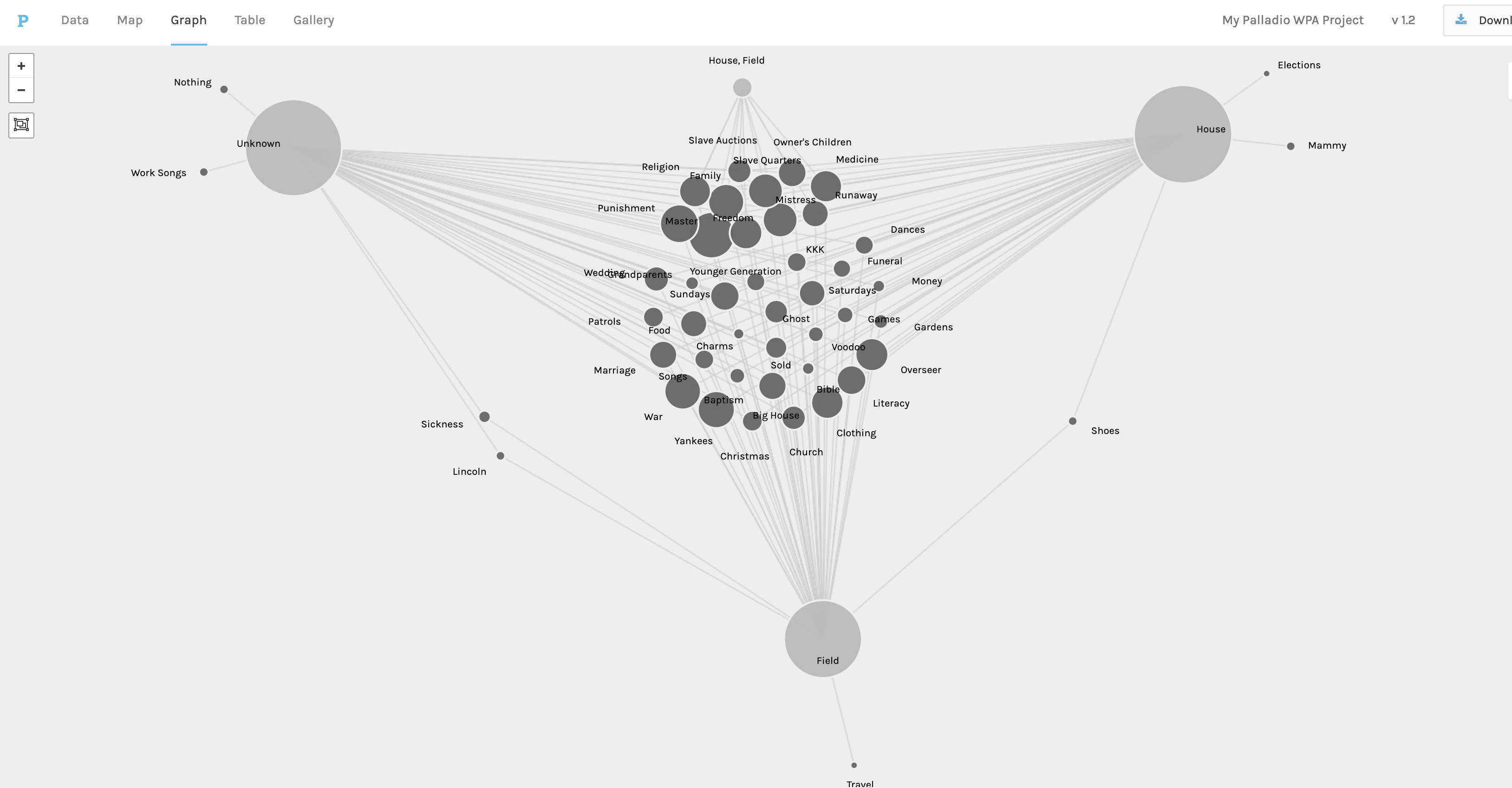
The best graphs generated were the ones where at least one of the nodes (source or target) pulled data from a field with not much variety, say Type_of_Slave (house, field, or unknown), or M/F (male or female). These representations showed me the relationships between the interviewer and the type of slave he or she interviewed. I can tell that some interviewers only worked with one type of (former) slave (which appear in the outer parts of the triangle that I formed), whereas others may have worked with two types of (former) slaves (which appear in between target nodes), and some even worked with three or more types (which would appear in the center of the triangular representation.
Same deal with the M/F field as nodes. I selected to see the M/F data related to the interviewer and the topics covered by that individual. This graph would be useful for a humanist with an interest in gender studies or social relations. I can see topics that both male and female interviewers discussed during their interviews, as well as those topics only covered by one gender. For instance, while male interviewers discussed the topic of Lincoln, women interviewers discussed elections in general. This visualization highlights some interesting aspects about topic selection for interviews. I liked working with these types of fields, as it provides me with much easier way to establish relationships and networks with the data. All I had to do was drag the M/F or the Type_of_Slave nodes to the outer sections of the graph to visualize relationships.
Palladio is a great way to get to know visualization tools for beginners like myself. It works best for bipartite networks, where I’m working with source node and a target node. I found Palladio to be very versatile, as far as creating visualizations on the spot.