Introduction
There are web-based digital platforms that empower users to upload data and explore it with the generation of visualizations. These are free of charge and fairly easy to use. Tools like Voyant, kepler.gl, and Palladio help examine digital sources in very distinct fashions. Voyant, for instance, focuses on corpus analysis, kepler.gl will do mapping of that same data; Palladio, it will perform network analyses. All three environments facilitate the study corpus in a way that they can make large-scale comparisons between corpus objects loaded onto these platforms. These tools allow users to perform a sort of distant reading of the corpus, which helps appreciate phenomena that is not typically visible when we read corpora the traditional way.
As a humanist interested in making use of digital tools for expanding research paths of inquiry, playing with these tools has been my first step in understanding them. Underwood emphasizes this point when inviting humanists to engage in algorithm exploration and to not look at these digital innovations with a sense of estrangement: “Researchers can never afford to treat algorithms as black boxes that generate mysterious authority. If we’re going to use algorithms in our research, we have to crack them open and find out how they work.” (69) Through the following comparative activity between three different platforms, Voyant, kepler.gl, and Palladio, I get to deepen my understanding of these technologies.
And what greater way to achieve this than by comparing the capabilities and limitations of these three digital tools with the use of the same corpus. For this review, I will concentrate on the data sets emanating from the WPA Slave Narratives, a collection of more than 2,000 interviews conducted with former slaves collected between 1936 and 1938 by FWP/WPA.
Voyant
Voyant is a text visualization project that allows the analysis of content appearing in the WPA Slave Narratives data set. It is a virtual environment where I engaged in the reading and analysis of digital texts collected and edited during the WPA interviews. Even though it is academic in nature, this tool is available to members of the public. It comprises five panels of ways of studying and making interpretations of text from a linguistic point of view. The Cirrus panel visualizes the frequency of terms within the corpus or within each document within it in the form of a word cloud.
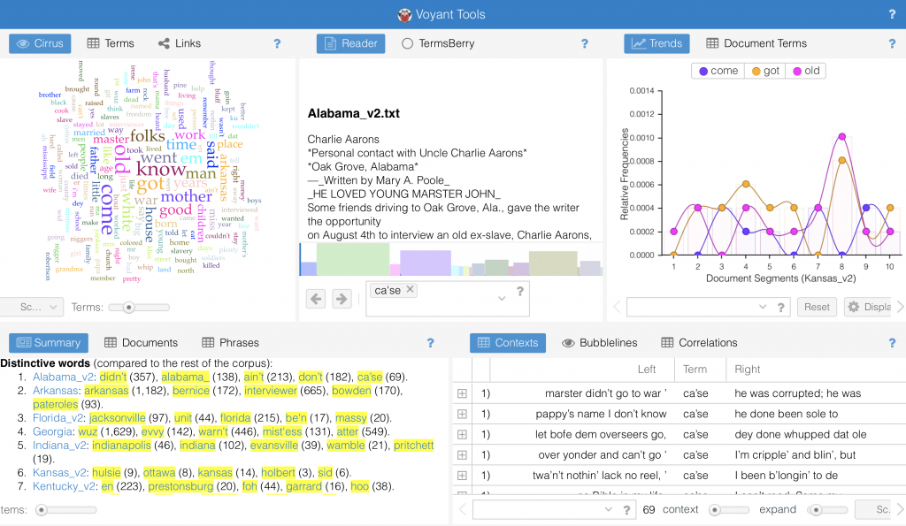
Users can make use of the Summary panel to instantly show the total number of words each WPA document contains (i.e. the Georgia document, the Kansas document, etc.), its lexical richness, and its textual distribution. It also helps us see distinctive terms and draw comparisons between different documents within the corpus. While the Context panel lets us study the concordances of each word and the context surrounding it, the Trends facet gives us a graphical representation with respect to the distribution of a word throughout the document or the corpus. The Reader panel showcases segments of text where words of interest can be located and studied.
One thing that Voyant does not do is mapping data, which is where a tool like kepler.gl becomes very handy.
kepler.gl
As a very robust mapping tool, kepler.gl lets users examine large data sets by generating a variety maps (points, clusters, categories, networks, and heatmaps) with its filters and layers.
Todd and Shepard (2014) when recalling historian Philip Ethington’s argument of how the mapping of historical places are indexed to spacetime coordinates, they assert the following: “Maps work, he argues, primarily by juxtaposition and simultaneity, bringing discrete data together to delve into the layered histories impacted in a given place.” (254)
And just like Voyant, kepler.gl comes with its different ways of visualizing data. The cluster map represents aggregated data, displaying the location where a group of interviews took place close to one another. The heatmap would be the one showing the density of points. While the point map shows points for a specific interview based on its location (lat/lng), the heatmap shows those hot areas where there is hot” areas where there are multiple points. The time map visualizes when interviews took place. Its timeline feature lets you reveal the order in which the interviews were taking place across time. The Category map displays the interview sites of “house” slaves (magenta) and of “field” slaves (light pink).
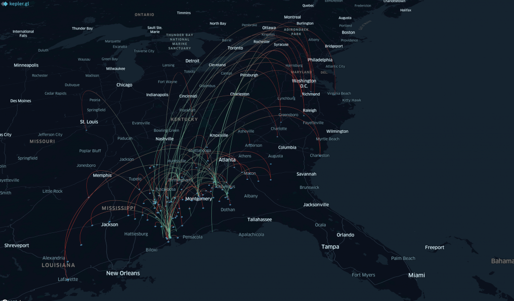
The network map, which was one of the most interesting visualizations, shows where the interviewees had their interviews, most probable, the cities within continental U.S. where they moved to (arcs). It also displays the location of enslavement (dots/points).
Whereas Voyant can be instrumental in providing a text reading and linguistic analysis arena to study the WPA Slave Narratives corpus and kepler.gl proves itself useful in mapping the same type of data to a location, users could complement these two platforms with Palladio.
Palladio
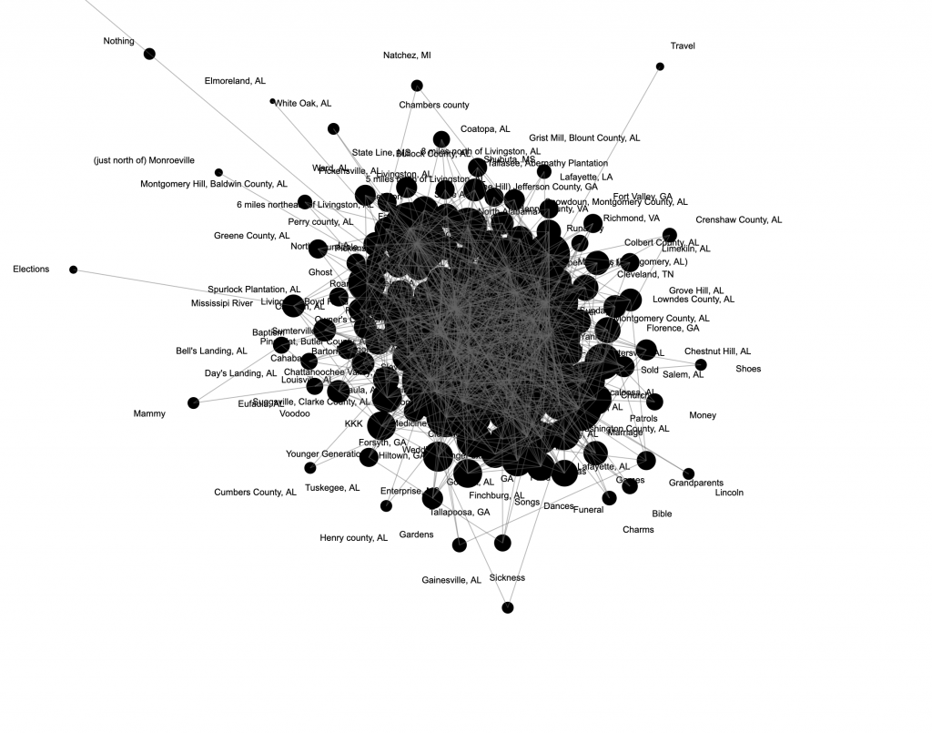
With Palladio, users have the ability to create multidimensional visualizations of data for humanistic inquiry with this tool. This environment lets you reveal complex hidden patterns and structures based on textual sources. Users can extract data related to individuals, locations, topics, among other types. In this case, I was able to visualize the different relationships one can establish with a data set from the WPA Slave Narratives. In order to use Palladio with any data, the attributes must be first codified in order to be successfully exported to this platform and be visualized. Data can be exported in various formats, including .cvs and .txt. The visualizations that I generated on this platform are based on (1) the additional tables I made, which created network associations between tables; the selections I made; but more importantly, on the way the data was codified before uploading it.
In terms of the graphs that I generated with my selections, these were more interesting that the map. And yes, I’m employing the term “grap” when referring to networks, a point made by Weingart (2011) when demystifying networks.
By adding filters that helped me select to view data based on the gender of the interviewer, for instance, I was able to see a visual representation of all males conducting interviews. This might be useful to a humanist interested in pursuing a gender studies inquiry path. The facet filter feature allows me visualize a subset of the data that would interest me at that moment. It is actually kind of cool to have some control over which elements of data I want to visualize and can move beyond the location dimension.
The best graphs generated were the ones where at least one of the nodes (source or target) pulled data from a field with not much variety, say Type_of_Slave (house, field, or unknown), or M/F (male or female). These representations showed me the relationships between the interviewer and the type of slave he or she interviewed. I can tell that some interviewers only worked with one type of (former) slave (which appear in the outer parts of the triangle that I formed), whereas others may have worked with two types of (former) slaves (which appear in between target nodes), and some even worked with three or more types (which would appear in the center of the triangular representation.
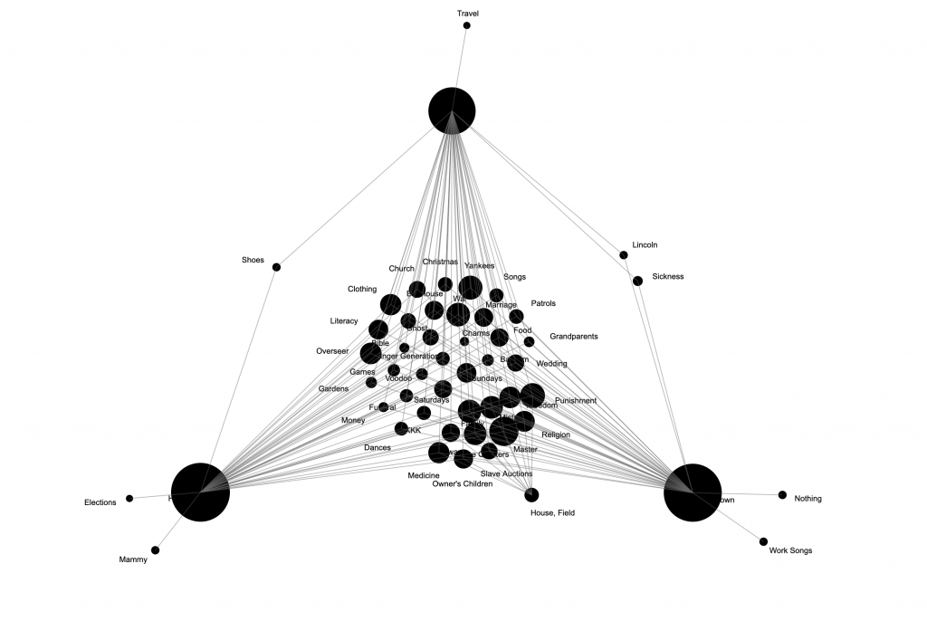
As Weingart asserted, “networks can be used on any project. Networks should be used on far fewer.” Some network representations on Palladio were not effective, especially those that included too many data points for both the source and target nodes.
For the most part, Palladio was a great way to get to know visualization tools for beginners like myself. It works best for bipartite networks, where I’m working with source node and a target node. I found Palladio to be very versatile, as far as creating visualizations on the spot.
In summary
All three digital tools are ideal for expert and non-expert humanists, as they are fairly easy to use, highly interactive and customizable, depending on what type of data we want to use and project. But choosing between them or a combination of them would depend of the type of data that you have and on your research interests.
Historian, Richard White, when describing the important of spatial analysis tools, makes an assertion that applies to all three of these tools examined when he states: “It is a means of doing research ; it generates questions that might otherwise go unasked, it reveals historical relations that might otherwise go unnoticed, and it undermines, or substantiates, stories upon which we build our own versions of the past (White, 2010, as cited in Presner & Shepard, 254)
If your research questions deal with where and how words are used in WPA interview transcripts, then I would go with Voyant. If you want to associate the transcripts to a geospatial location to better understand migration patterns of former slaves after emancipation, then take advantage of a mapping tool like kepler.gl. If you want to look at historical data across time and determine a network of relations, then I’d recommend Palladio.
Sources:
Presner, Todd, and David Shepard. “Mapping the Geospatial Turn.” In The New Companion to Digital Humanities, edited by Susan Schreibman, Ray Siemens, and John Unsworth, 247-259. Chichester: Wiley Blackwell, 2016.
Underwood, Ted. “Theorizing Research Practices We Forgot to Theorize Twenty Years Ago.” Representations 127, no. 1 (2014): 64-72.
Weingart, Scott. “Demystifying Networks.” Scott Weingart (blog), December 14, 2011.